Brand Guide
The King William Law Center Identity
A working guide to the marks, color, type, and voice of King William Law Center. Built to the standard Good Creative Media sets for any client: consistent, considered, and ready for a full campaign across signage, print, web, and social.
The idea
Heritage, Held to a Modern Standard
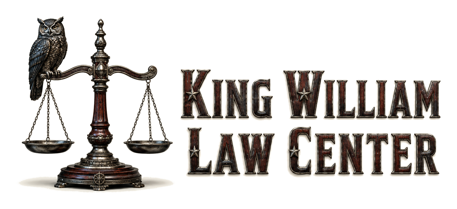
The brand has one job: make a shared address feel like an institution without pretending three independent firms are one. The owl brings judgment and vigilance; the scales carry the law; the wood and metal details give the mark the weight of an established South Alamo office. Old-world craft, clean execution.
The name
King William Law Center, on South Alamo
The name leads with the neighborhood people recognize, then keeps the address grounded: a shared law office in King William on South Alamo Street. Shorten it and you get KWLC, a compact monogram that can live on internal room systems, social avatars, print pieces, and small-format signage without implying the three independent firms are one firm.
The mark
An Owl-And-Scales Mark With Five Working Parts
Every element earns its place. Nothing is decorative for its own sake.
Judgment
Calm attention, watchfulness, and the discipline to see what others miss.
The Law
A direct signal that this is a legal address, readable from a browser tab to signage.
Independence
Three separate firms under one roof, held in one visual system without becoming one firm.
Heritage
Warm, established, and appropriate to a restored South Alamo professional office.
Craft
Detail, precision, and the sense that the work here is built rather than improvised.
One Institution
Read at a glance from a brass plaque or a phone screen. Built to scale both directions.
The icon
The Owl and Scales Stand Alone
Where the full lockup will not fit, a browser tab, an app icon, a social avatar, a watermark, the owl-and-scales mark carries the brand by itself. Keep clear space around the owl’s ears and the scale arms, and never set it smaller than 24 pixels.

favicon · 64px
Color
Oxblood and Navy, on Limestone
Oxblood is the through-line. It is the same red carried across every property in the family, so the whole family of sites reads as one network. Navy steadies it; limestone and ink do the quiet daily work.
Core
Oxblood
#7B1E2B · the shared red, key accents
Mission Navy
#1A2948 · the border, headlines of state, structure
Neutrals
Limestone
#F2EDE3 · paper, backgrounds
Ink (black)
#1C1B18 · body text and headings
Bone
#FBF8F1 · cards, alternating sections
Typography
One Sans Family, Every Weight
The wordmark is sans, so the type is too. Inter does all the work, from a heavy display headline to body copy, kept tight and modern.
Inter, Display
Headlines and big display lines, weight 700 to 800, letter-spacing tight. Confident and modern.
Inter, Text
Body, UI, labels, and eyebrows, weight 400 to 600. Legible from a caption to a paragraph.
Voice & tone
Plain, Dignified, San Antonio
Speak like a senior attorney who respects the reader’s time: clear, warm, and never inflated. Authority comes from precision, not adjectives.
- Use short, declarative sentences.
- Name the place: King William, Southtown, the courthouse.
- Keep the three firms distinct and independent.
- Let the work speak; cite facts, not superlatives.
- No outcome guarantees or comparative claims.
- No “best,” “expert,” or “#1.”
- No em dashes, and no “quick.”
- Never imply the firms are one partnership.
In the world
Applications
The same system, from a link preview to a lobby plaque.

- Website
- Signage & plaques
- Letterhead
- Business cards
- Email signature
- Conference-room booking
- Social profiles
Every surface uses the owl-and-scales mark, the oxblood-and-navy core, and the two typefaces. Nothing freelances.
Identity
Brand and identity by Good Creative Media.